Project Overview
This prototype was created following the Goal-Directed Design methodology. This design method follows a multi-step process flowing through phases of Research, Modeling, Requirement Gathering, Framework, and Refinement. As this was completed as a class project, these phases were shortened to fit within the given time constraints.
Tools: Figma, FigJam, Microsoft Teams
Design Process - GDD
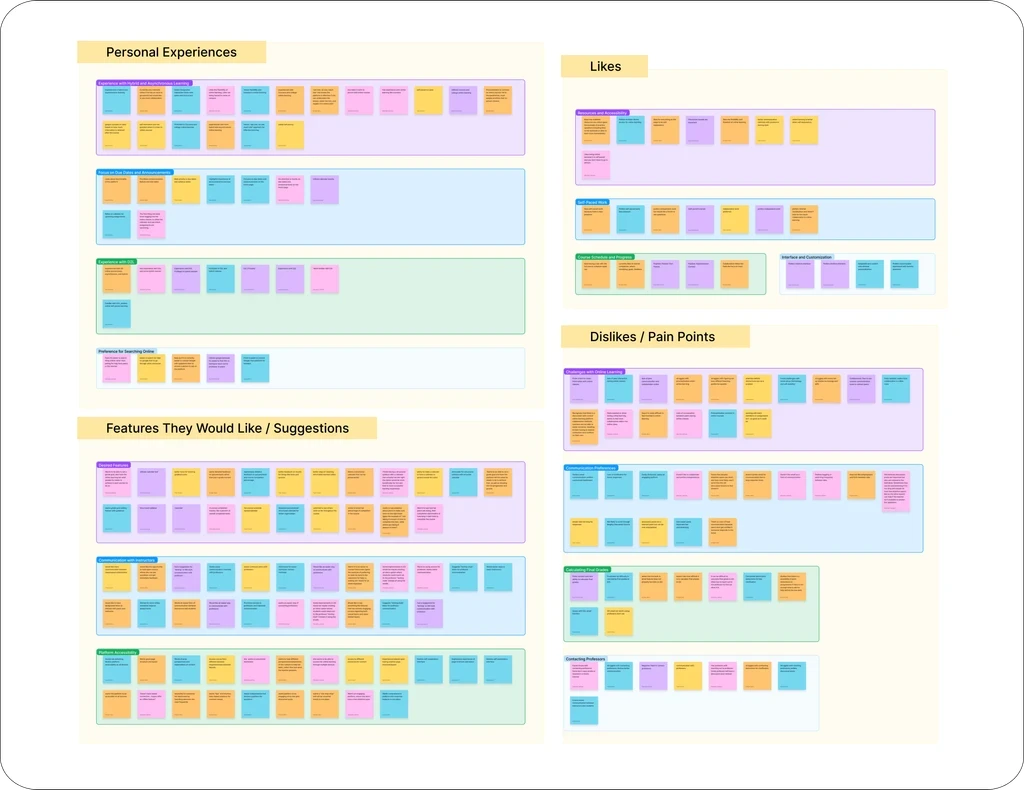
Research
My team and I found important gaps in online learning by reviewing research and talking to users. We noticed that most platforms focus on delivering content but don’t offer enough options for collaboration or personalization. We looked at studies about Massive Open Online Courses (MOOCs), learning management systems (LMS), and how people engage with e-learning. Through user interviews, we discovered common frustrations, and we used affinity mapping to organize these issues, which helped guide our design choices.
Requirements
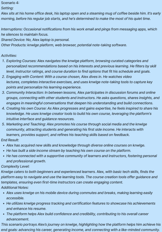
Based on our research findings, I created problem and vision statements, developed context scenarios, and put together a list of requirements. These requirements focused on making the platform more interactive, improving the tools for creating courses, and ensuring the experience was easy to use for different learning styles.
Design Process - GDD
Research
My team and I found important gaps in online learning by reviewing research and talking to users. We noticed that most platforms focus on delivering content but don’t offer enough options for collaboration or personalization. We looked at studies about Massive Open Online Courses (MOOCs), learning management systems (LMS), and how people engage with e-learning. Through user interviews, we discovered common frustrations, and we used affinity mapping to organize these issues, which helped guide our design choices.
Requirements
Based on our research findings, I created problem and vision statements, developed context scenarios, and put together a list of requirements. These requirements focused on making the platform more interactive, improving the tools for creating courses, and ensuring the experience was easy to use for different learning styles.
Wireframing
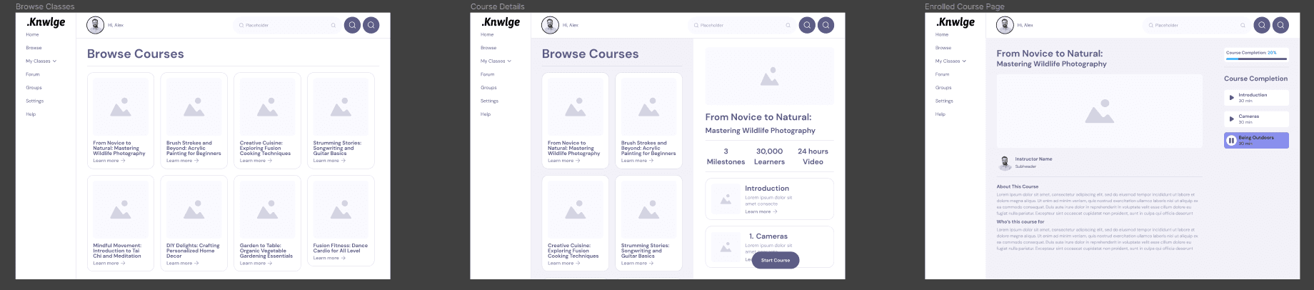
Following our brainstorming sessions and initial concept ideation, we transitioned to FigJam to develop mid-fidelity wireframes. These wireframes represent a more detailed visualization of our platform's interface, incorporating essential elements and interactions while maintaining a level of simplicity and flexibility.
For our mid-fidelity wireframes, we focused on crafting key-path scenarios that reflect the most common user journeys within our platform. One of our primary scenarios centered around the process of accessing and enrolling in online courses. We aimed to streamline this path, ensuring that users can easily discover relevant courses, view course details, and enroll with minimal friction.
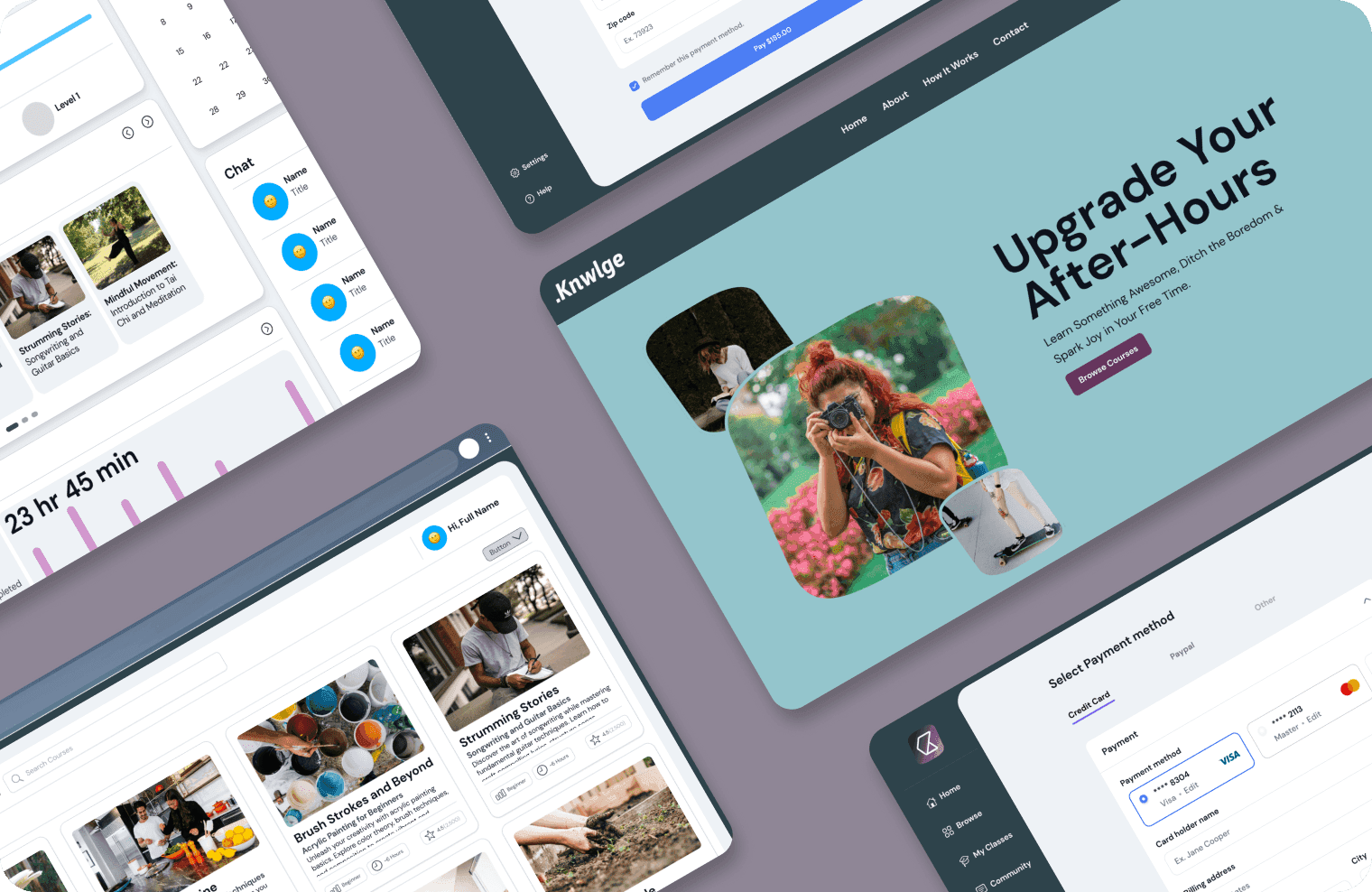
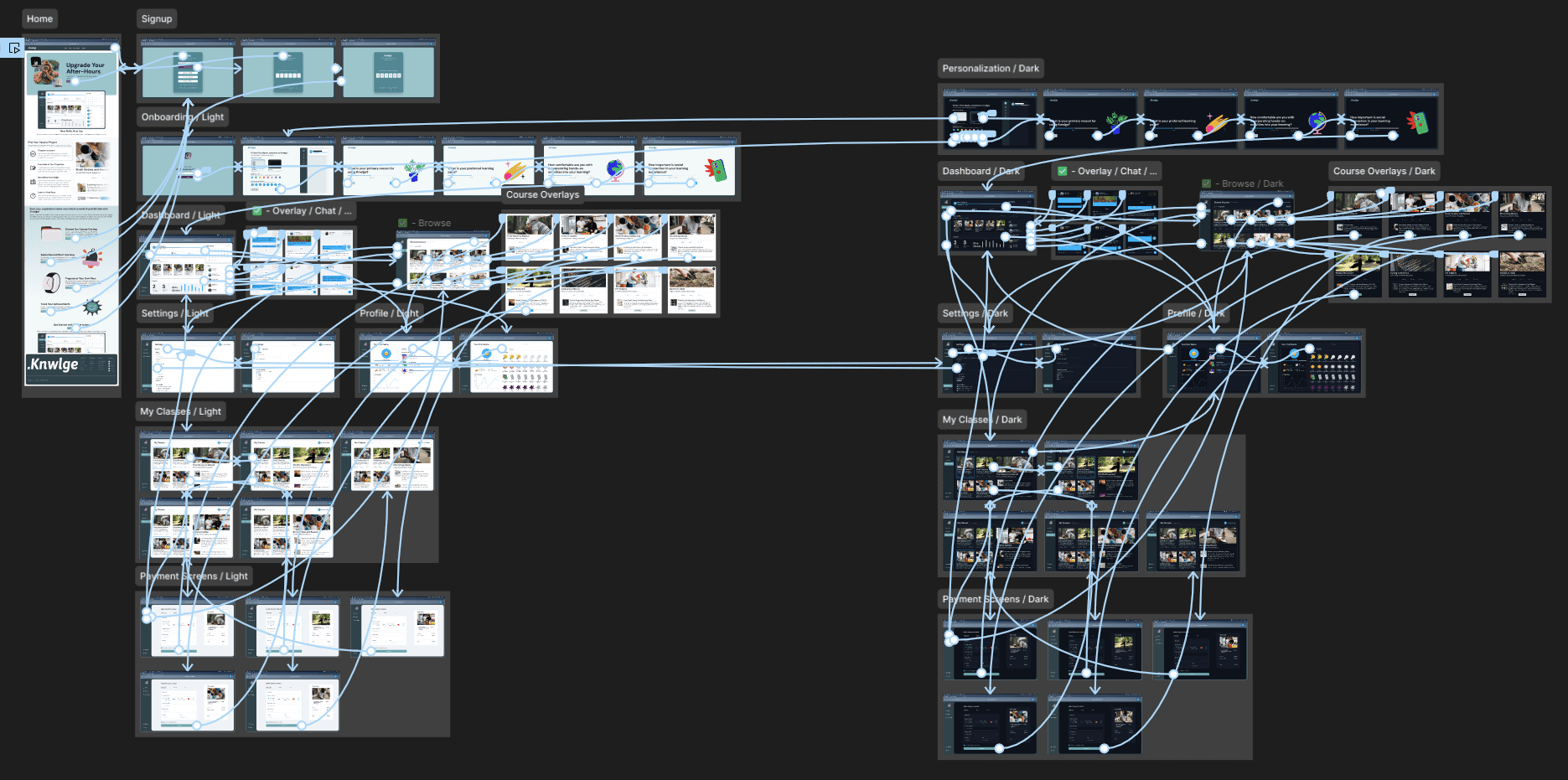
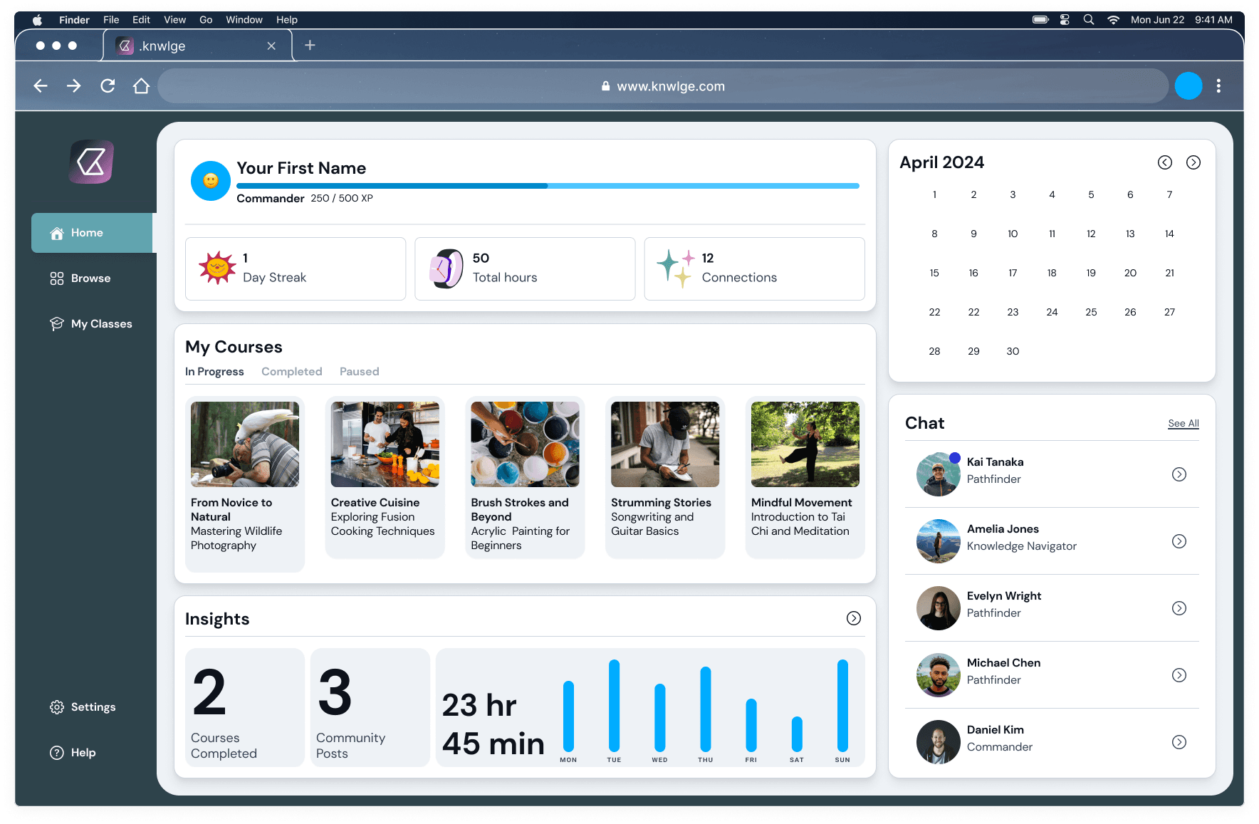
High-Fidelity Prototype
After finishing the mid-fidelity wireframe, we started building a high-fidelity prototype of our app. We added branding, color schemes, and more detailed design elements to make it look like the final product.
In the high-fidelity prototype, we didn’t just focus on the design. I also worked a lot on making the app function well by using new features in Figma, like local variables and conditional logic. For example, the Username section updates and follows you as you move through the app. The onboarding process also changes with different colors and profile pictures. These features helped our project stand out at the Capstone event.
Post Project Thoughts
The biggest challenge was the lack of usability testing, which meant we couldn’t see how real users would interact with the platform. While we made small improvements based on team feedback, proper testing could have uncovered issues and helped us refine the design even more. If we had more time, usability testing would have been a game-changer, giving us better insights to improve user experience. Even without it, we’re proud of how the project turned out and the thoughtfulness behind our design choices.